Built a social bookmarking app in six weeks
Summary:
Learnlistt is a tool that enables anyone to curate their favorite resources in a topic to share with others. It’s an idea Laura has been thinking about for a while. She wanted something like Goodreads that allowed you to share more than just books.
What we did:
Initial concept, research and site map
UX and UI design for responsive web app
Full stack serverless development (React, GraphQL, Prisma, Vercel)
Logo and brand design
Marketing activities to test validity as a business.
Monitored analytics based on conversion funnel
I LOVE LOVE LOVE Learnlistt. Such an amazing idea. I just created a course and it felt so easy and accessible. Thank you for creating something that democratizes teaching and learning. I can’t wait to see what’s next.
Katie W., Learnlistt user
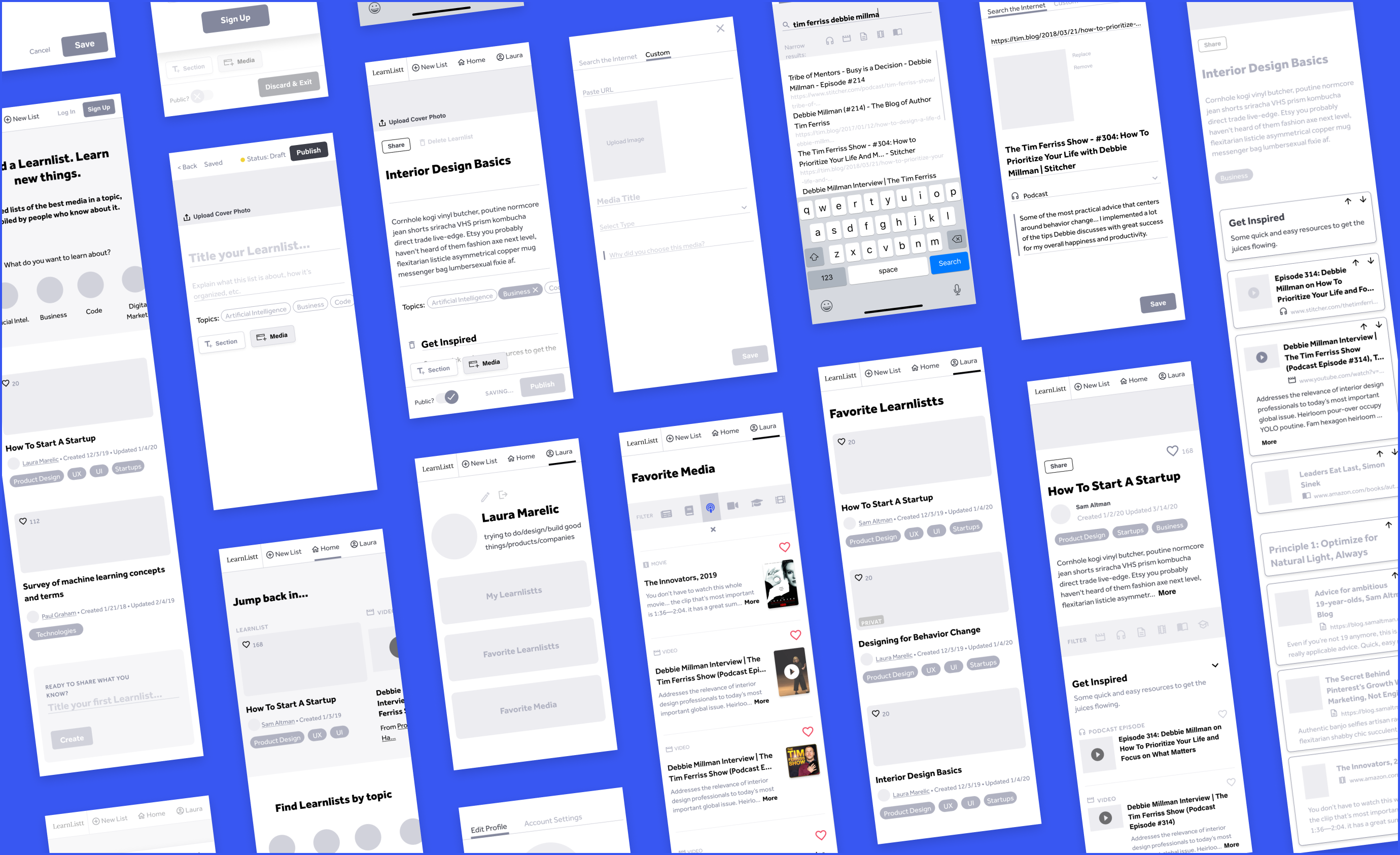
We built all the major social features from scratch. Sign up using Google, like, comment, and save. We also built a fairly complex scraper that made it easy to pull in meta data from any link.
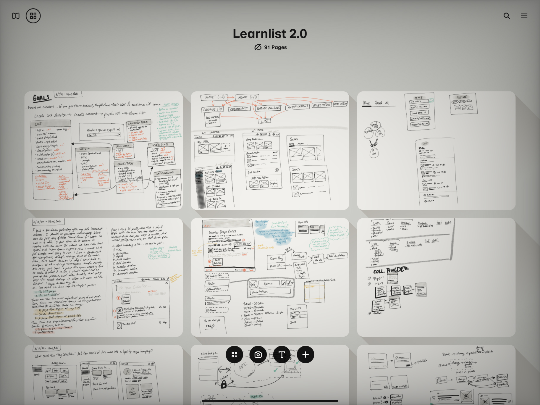
First things first: a sitemap that pares back functionality. Learnlistt 1.0 had a bunch of potentially useful features that ultimately made the UX confusing. We made this version as simple as possible without sacrificing the core functionality of the idea.
We then create wireframes of the entire experience while setting up the coding infrastructure.
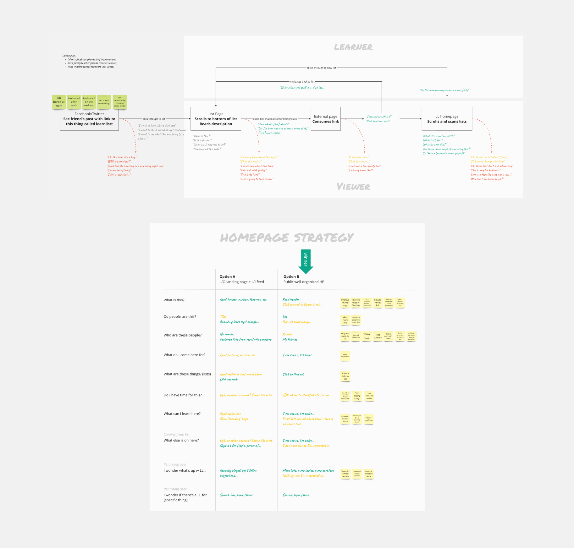
Top: Once we had the MVP online, we dug deeper to make this journey map of an anonymous viewer becomes a “learner,” our term for an engaged logged-in user.
Bottom: Chart to help us figure out if learnlistt.com should have different experiences for anonymous visitors and logged-in users. We changed the homepage a lot based on what we learned in conversations with users.
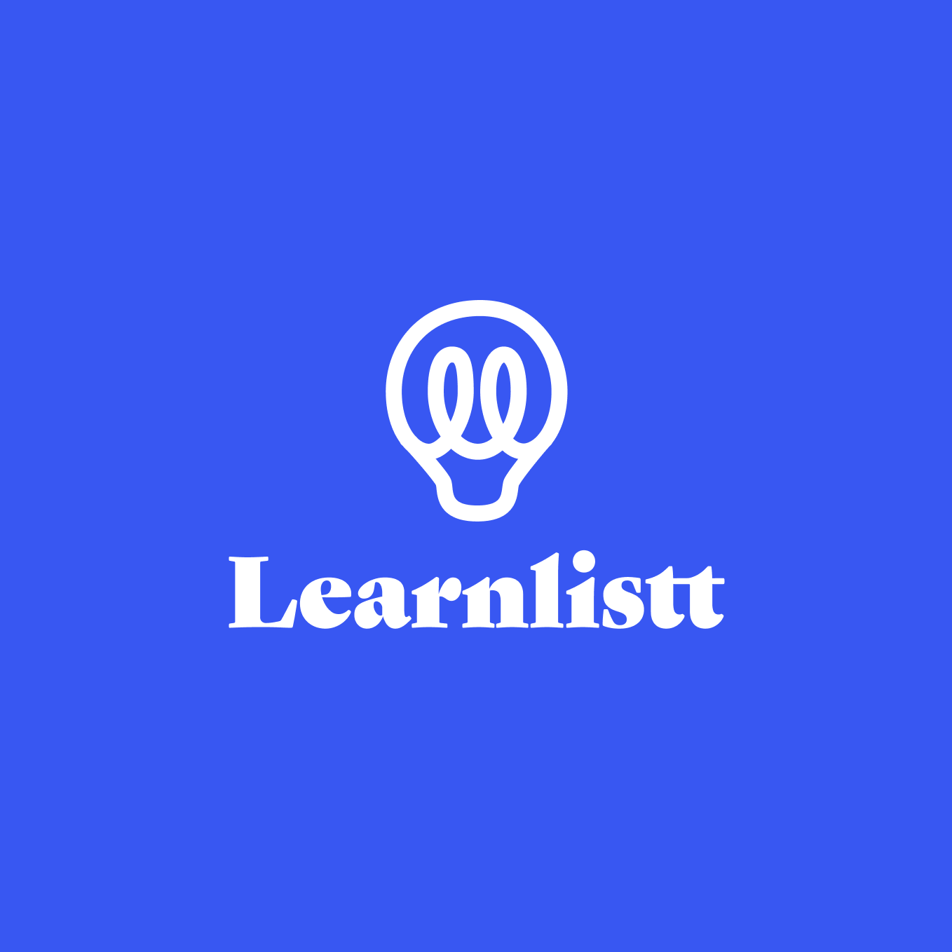
The logo highlights the double L and the lightbulb symbolizes knowledge. The font was, quite frankly, something funky we've always wanted to use.
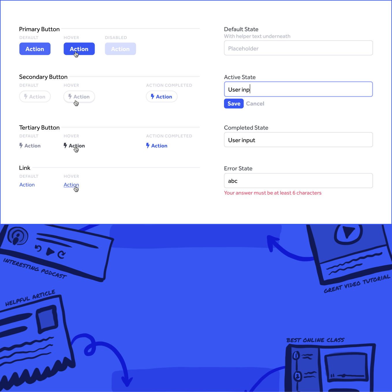
The brand and UI kit came together quickly. We chose just one color to use throughout the UI to reduce clutter. We based the illustration style on a typeface called Permanent Marker, which we used sporadically for small callouts and tooltips.
This was Learnlistt's main mechanism. Users can search for a resource and Learnlistt will automatically scrape for an image and meta data. Then users can easily add an annotation and drag and drop to reorder either individual links or sections of links.
More Work
LTCA
LTCA
Modernizing a traditionally offline business

Cookin
Cookin